Hearts Pub Play & Drink
Old-School Charm, Next-Level Play
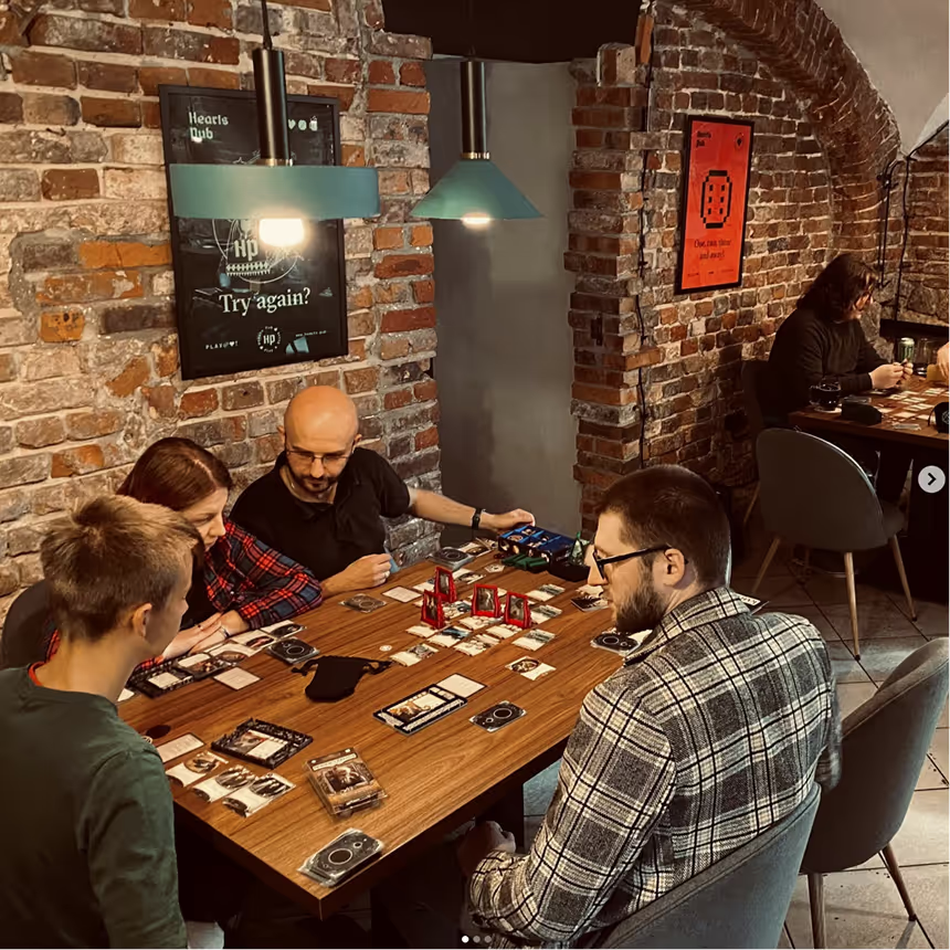
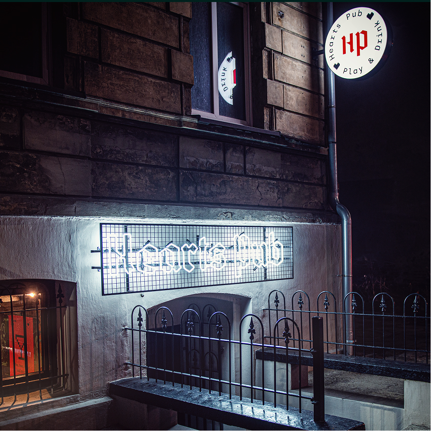
Hearts Pub is the first gaming pub in Gliwice created by a gamer for gamers. Located near the academic complex, it is a place where, away from the hustle and bustle, you can meet with friends, have a good beer and play a board or video console game.
The basic goal of this project was to respond to dualistic characters of the brand.
On the one hand, Hearts Pub is a traditional pub in the most literal and classic sense. On the other hand, equally important, it's a gaming pub. The main intention was to merge these two contrasting ideas to create a coherent and consistent visual language.
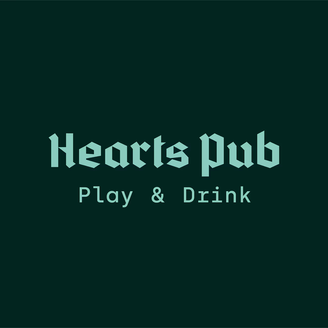

It's not a gaming pub that looks like a traditional pub. It's not a traditional pub that looks like a gaming pub. It's both. The visual identity of this brand is a unified concept. The viewer will experience both parts simultaneously.
When you think about pixels, glitches, old games, new games... and when you think about traditional pubs, beer, dark wood, warm interiors, there is obviously a big contrast. Our journey was showing that, in this case, they can live together and coexist.
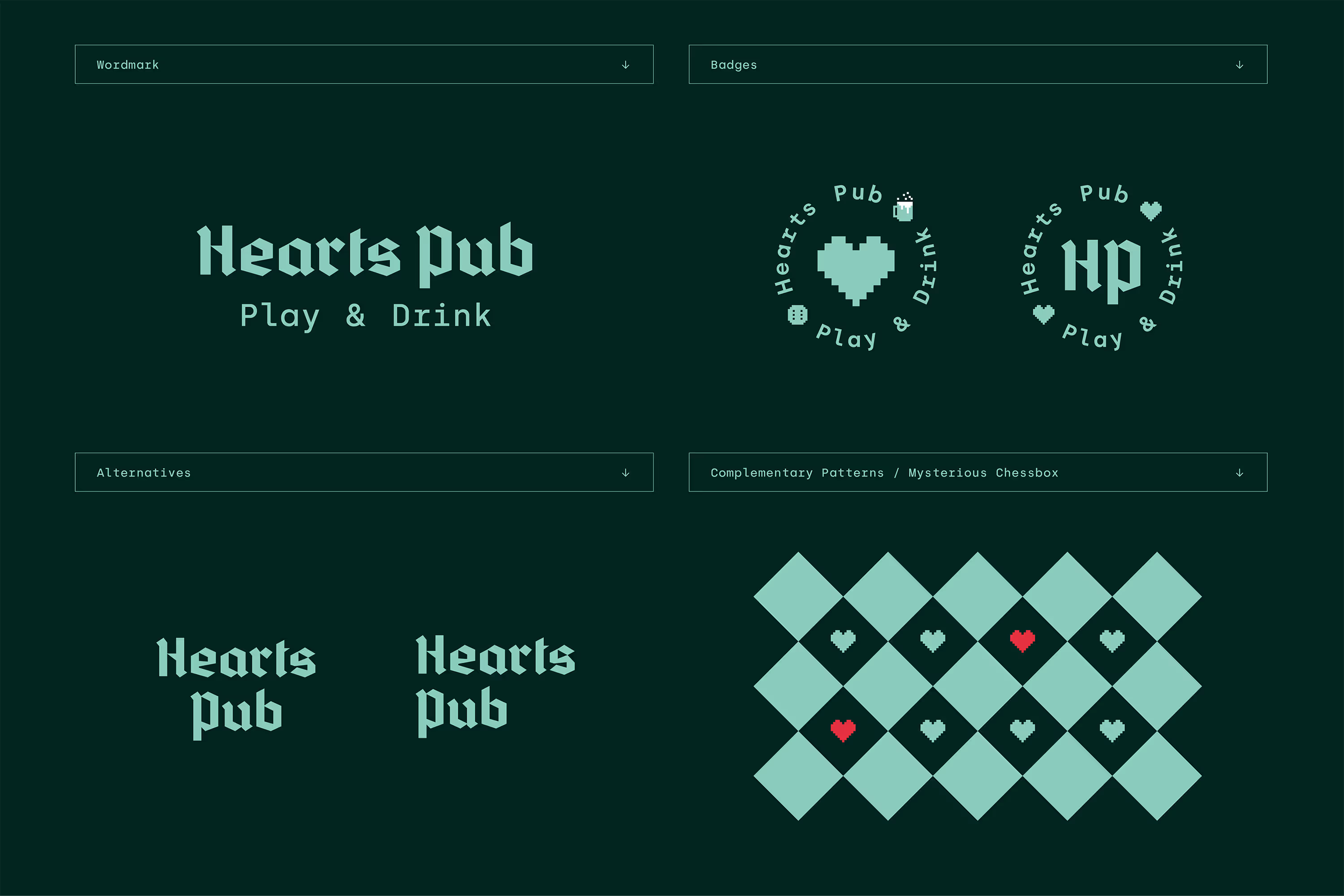

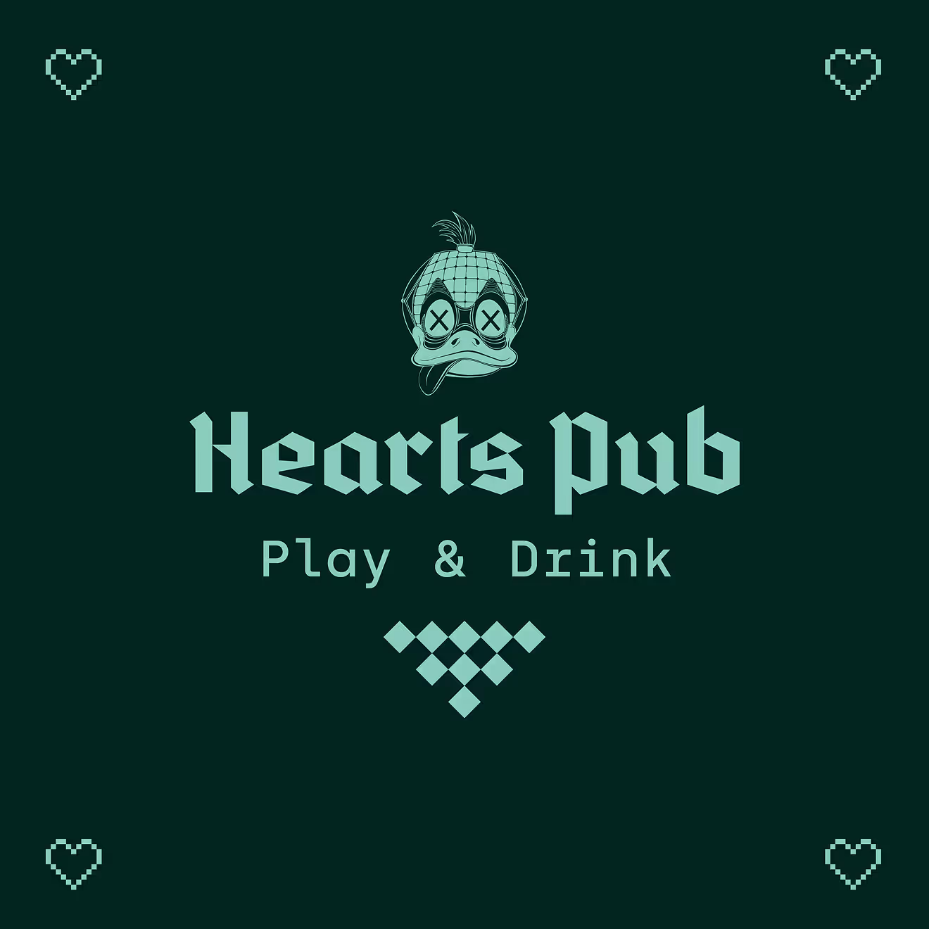


We named it Hearts Pub because we believe that the heart symbol has a broad application in many fields.
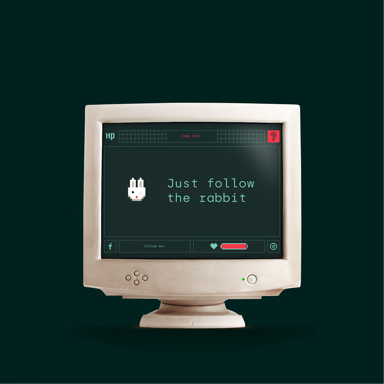
For example, it could be understood as a heart in card games or as a health level in a digital game. HP can be seen as Hearts Pub or hit/health points.
During the week, your health points and stamina are going down as your energy is drained. At the end of the week, you can come to the Hearts Pub to refill.
The heart can be also understood as the source of life, the source of courage and strength, a symbol of love and connection.All of these things can be brought together at the Hearts Pub.
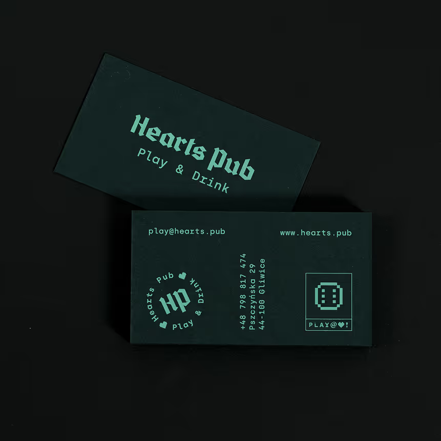
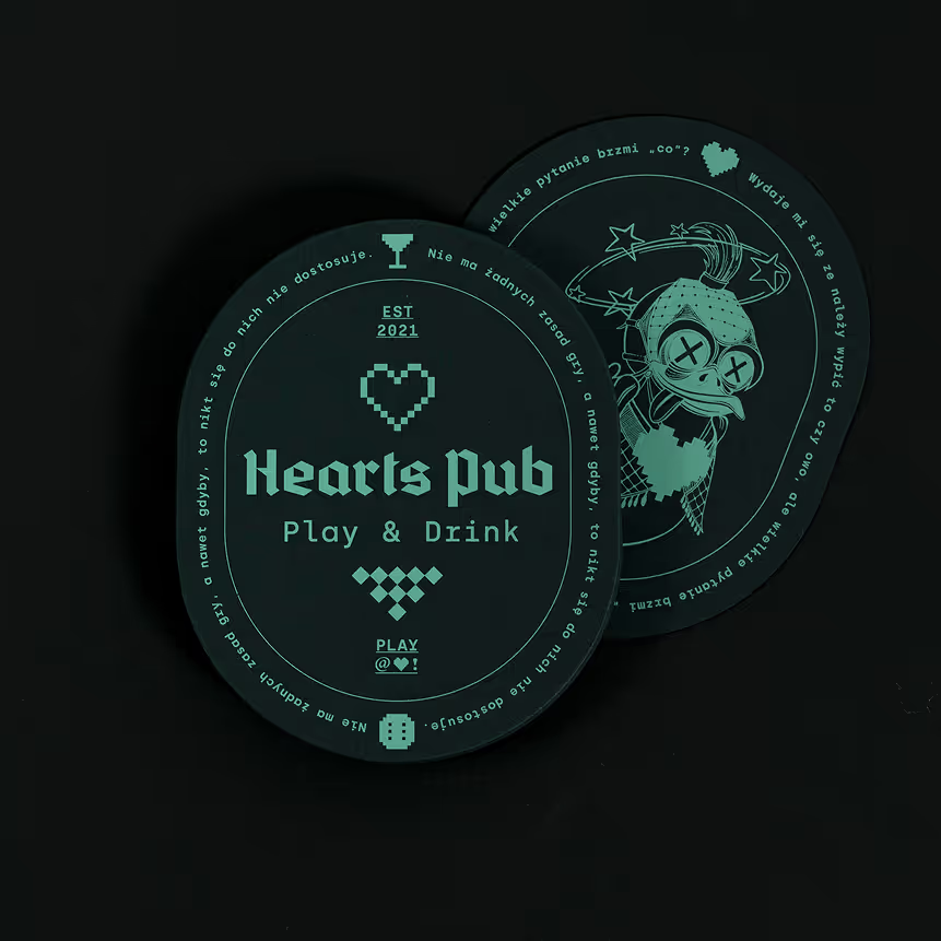


The rule of contrast.
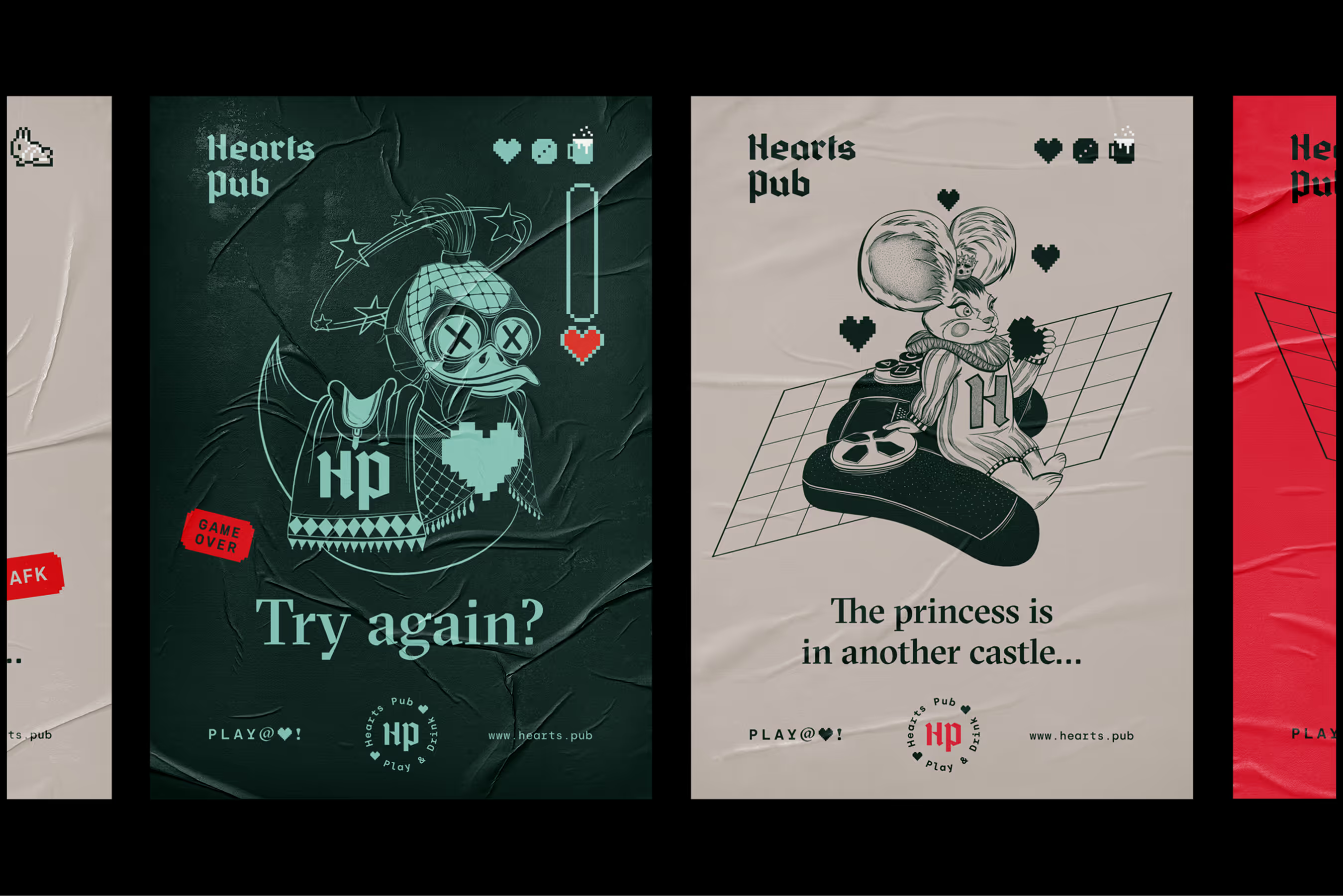
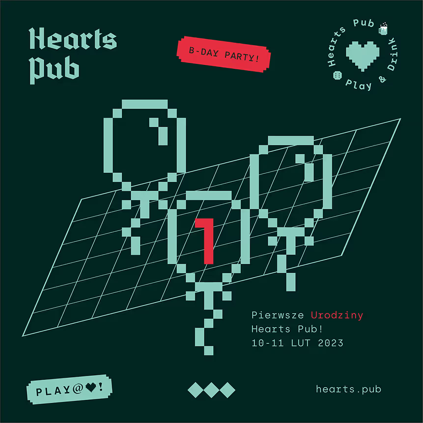
The visual language is built on the principle of blending contrasting elements.
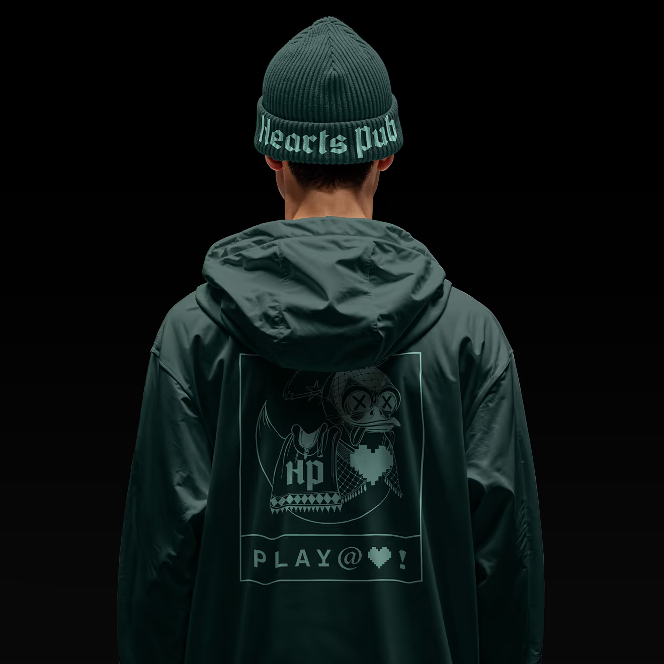
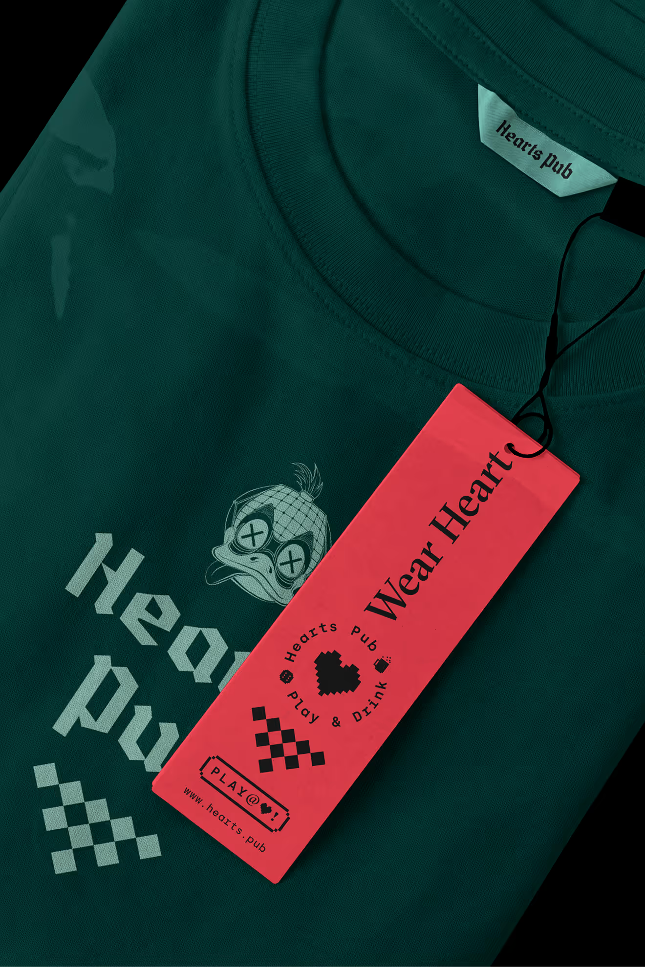
Whether it is lettering where the calligraphic serif intersects with a geometric monospace, or illustrations, where freehand drawings are complemented by retro pixel icons, the viewer will understand both simultaneously as a one piece. It happens on every level of the system.







What our Clients feel of
Studio designed an Identity for our Gaming Pub located in Gliwice. It came out great, along the way the identification still won an award, and every time customers pay attention to how great it looks. It's worth approaching the subject professionally at the beginning, so that we don't have to deal with it when our business starts to grow dynamically.

